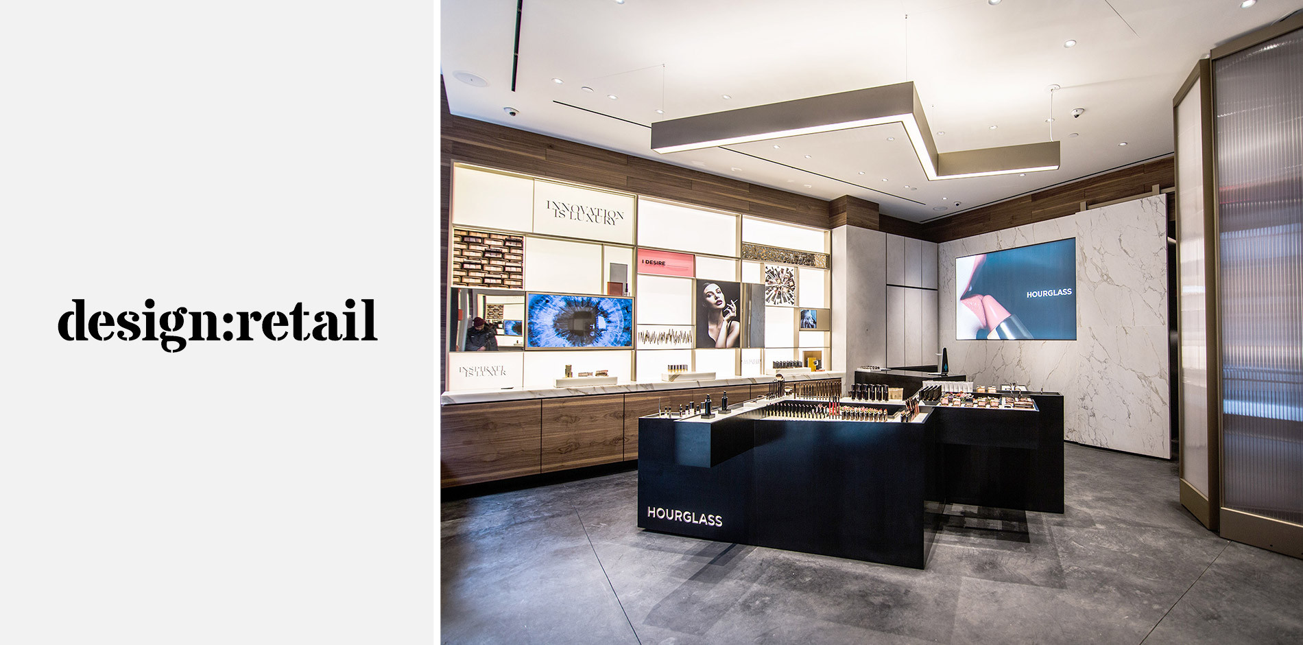
In just 10 weeks, Shawmut fit-out Hourglass Cosmetics’ 830-square-foot SoHo location. design:retail spoke with the project design team to understand how the store came to life, creating a space that showcases and reflects the cruelty-free beauty brand’s products.
Excerpt from design:retail
Designed by New York-based O’Neil Langan Architects, this is the first East Coast brick-and-mortar store in the Hourglass portfolio, second to its flagship location on Abbot Kinney in Venice, Calif. Created with the intent of mirroring the Hourglass product design throughout the store, the space features captivating materials and visuals. A bold, backlit “Innovation is Luxury” art piece adds drama on the store’s “hero product wall”—a display of brand equities in sculptural vignettes. The store design includes a blend of Calacatta marble, a bespoke champagne-gold metal finish, custom-made plaster with mineral aggregates, fluted glass, black concrete and walnut wood. Custom movable floor-to-ceiling screens can be positioned to create a private room for treatment and beauty applications.
