Excerpt from Los Angeles Times:
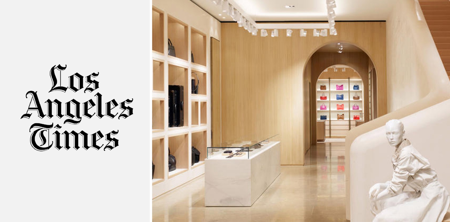
BEVERLY HILLS, CA – Italian luxury brand Bottega Veneta opened the doors of its new Beverly Hills maison last week, a 4,828-square-foot, two-story retail space at 320 N. Rodeo Drive that manages to augment the shopping experience with an immersive short course in Southern California architecture.
The Kering-owned label is no stranger to the storied shopping street, having opened its second U.S. store there in the late 1970s, and, until recently, occupying a single-level space at 457 N. Rodeo Drive. But it’s just the second in the brand’s new maison concept (the first, located in an 18th century palazzo, opened in Milan in 2013), a retail space designed to be less cookie-cutter and more reflective of geographic surroundings. In this instance, the man behind the concept – Bottega Veneta’s longtime creative director, Tomas Maier – was inspired by some of the architectural styles he’d become familiar with on visits to Santa Barbara and Montecito during the last three decades.
“I like that Mediterranean Revival [look] because it’s got a poverty to it — no ornamentation, no decoration,” said Maier, singling out Lutah Maria Riggs’ design for the Montecito estate of Baron and Baroness Maximilian von Romberg, which served as the starting point. “[Riggs’] Von Romberg house is a great example,” he said, “because it’s Mediterranean Revival but it’s very modern at the same time. It’s almost like the first step into Midcentury [style] because it’s so undecorated and unornamented. … What really inspired me was the idea of restraint in color, in surface, in the type of materials they used.” Other architectural influences included the Spanish Colonial Revival style popularized by George Washington Smith and Bertram Grosvenor Goodhue.
The result is a retail space with an organic feel (well, as organic as you’re likely to get on Rodeo Drive, anyway); based in a color palette of neutral, earthy tones, the walls and ceilings are bleached oak, the floors are tiled in various types of pale stone and corners are rounded. The architectural centerpiece of the first floor is a thick, curved plasterwork banister that arcs gracefully up toward a skylight-topped second floor that floods the space with natural light filtered through wooden slats.
Continue to Los Angeles Times here
