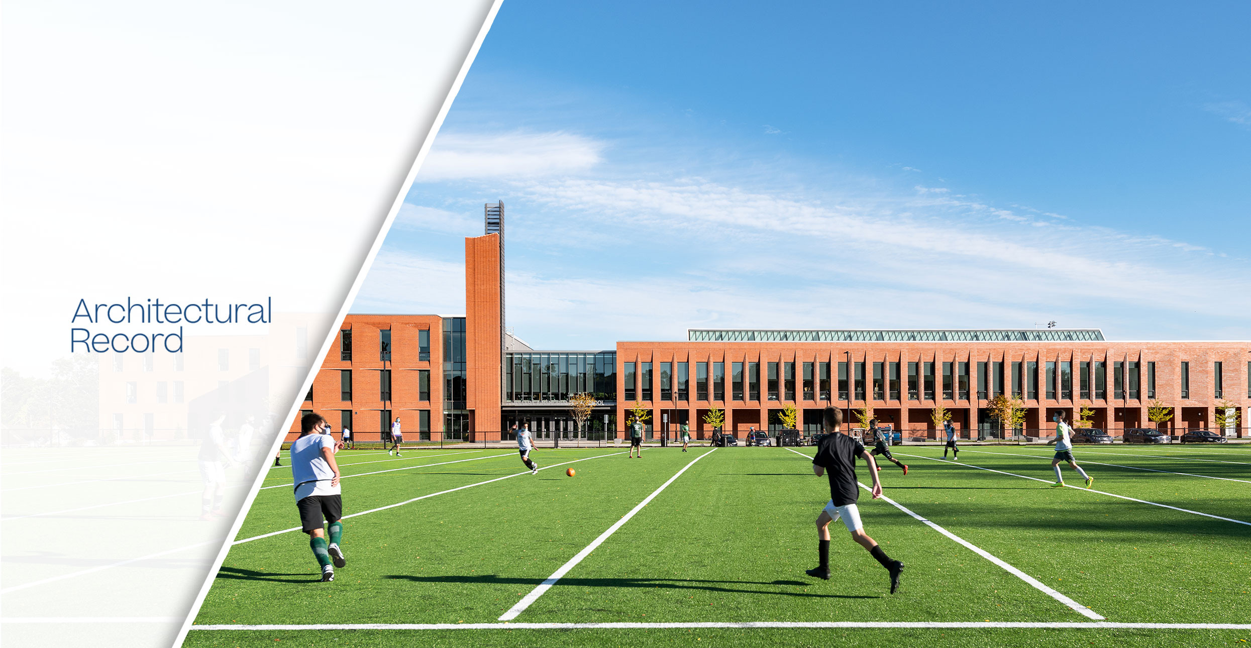
Gracing the cover of Architectural Record’s January 2021 issue on Schools of the 21st Century, Billerica Memorial High School—designed by Perkins & Will—is a state-of-the-art model as an academic center intended to educate its students in an innovative, healthy, and flexible environment.
Excerpt from Architectural Record
For a new high school northwest of Boston, Perkins&Will has mined the past and looked to the future, reflecting the evolution of the suburb where it is located. Incorporated in 1655, Billerica, Massachusetts, shifted over time from an agrarian center to a 19th-century mill town. Today, with a population of 43,000, Billerica increasingly feeds and hosts the high-tech industry, which has spilled out across the Greater Boston area.
When it came time to replace its aging high school for more than 1,600 students in grades 8–12, the town wanted to add a pre-K program and make the new facility a community center, with public access to the gymnasium, auditorium, and dining commons, among other spaces. The 1950s school building, expanded with flimsy additions, was poorly lit, not ADA-compliant, and could not easily accommodate new technology and changing pedagogy.
“The ability to collaborate and evolve through critical thinking is the focus of education today but was not the focus 50 years ago,” notes town manager John Curran. Now Billerica wanted to make connections between disciplines within the school, as well as with the community—goals that involved careful siting of the new building, creative programming and spatial organization, and material choices.
At first, town officials considered relocating the new Billerica Memorial High School, but decided to remain on the same 31-acre site as the old school, which also holds the town hall and the fire and police departments. Yet the old school had to operate during construction, before being razed, so the site for the new school was pushed into the southwest corner of the campus, where it connects more closely with the surrounding neighborhood.
Perkins&Will’s Boston office began by figuring out how the school’s civic and educational components could work as partners, and how various functions could be integrated as well as segregated depending on the time of day. The architects conceived an L-shaped plan, with academic functions housed in one long leg, and the gym, auditorium, and arts programs in the other, with a triple-height commons as the hinge. For horizontal connectivity—as well as to control costs and keep the scale sensitive to the adjacent streets of single-family houses—they limited the building to four levels, with only three above grade. Daylighting also played an important role. “Schools are fairly predictable as to when and how they will be used through the course of the day,” says Perkins&Will associate principal and lead designer Patrick Cunningham. “You can approach daylighting and form in such a way that you push light and shadow around to animate the site and building.” For example, the team envisioned students entering from the east in the morning with early light playing off the facade. And they designed the massing of the academic bar, containing the classrooms, to ensure even light in those spaces throughout the day.
Significantly, too, the town’s heritage and identity of “humble pride” are evoked through a simple, durable material language, ratcheted up a notch, imbuing the prosaic with poetry. Traditional red brick clads the outward-facing elevations, conveying robustness, while elaborate corbeling adds a dynamic, playful edge—expressing what schools do for kids, note the architects: give structure, but leave room for invention. In contrast, the inward-, north-facing elevations are clad with metallic-gray-painted metal panels, which provide reflection and a sense of depth. “The materiality of this inner lining,” points out Perkins&Will principal and project leader Brooke Trivas, “allowed us to look to the future.” This same forward-looking attitude carries into the interiors with branding (in the form of the school color, logo, and slogans) and no-nonsense durable finishes like painted steel balustrades, terrazzo and rubber flooring, and latticed ash-wood ceilings and walls.
While the structure for the academic side of the building is steel, the public wing and the commons atrium use an exposed spruce-glulam-timber structure for the roof. Sustainable strategies include localized, efficient mechanicals as well as a high-performance insulated envelope (with attention to thermal bridging) and careful allocation of the 28 percent glazing budget to maximize daylighting, such as south-facing skylights that direct light deep into the building. Coupled with active dimming systems for its all-LED lighting, which reduces electric lighting demand by 44 percent, these decisions help achieve a site energy use 59 percent below the regional average for the building type, say the architects.
Continue to Architectural Record here.
