Excerpt from Architectural Digest
AD gets an exclusive first tour of the proclaimed world's best restaurant following its extensive—and thoughtful—renovation
After 11 years in its current home, in a soaring Art Deco space on Madison Square Park, partners chef Daniel Humm and restaurateur Will Guidara were ready to put their own aesthetic stamp on the restaurant, which they purchased from hospitality mogul Danny Meyer in 2006.
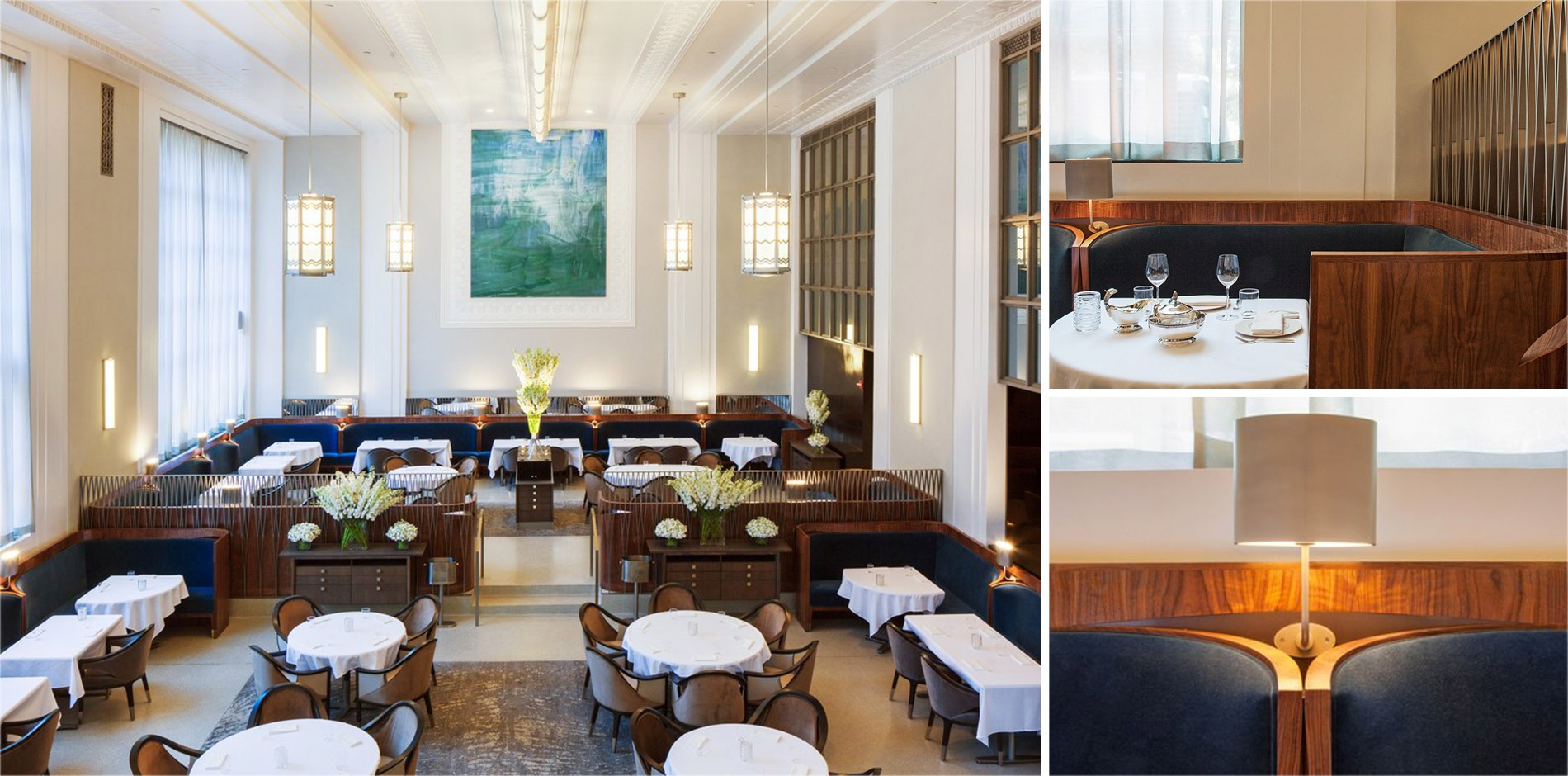
But what started out solely as a much-needed update to the front and back of house turned into something much more involved. Brad Cloepfil, principal of NYC-based architecture firm Allied Works, collaborated closely with the owners on the restoration and redesign of the space. The working relationship grew out of a personal one, as his studio is near the restaurant and he's been a regular for a decade. “The challenge was to preserve the memory and character of this great historic room, while creating a contemporary space that served their vision of food and service,” says Cloepfil. The landmarked Art Deco Metropolitan Life North Building's exterior was off-limits, but reimagining the interiors was up for grabs.
“There’s no more New York space than this one,” says Humm. “The inside isn’t landmarked, but we treated it like it was. We’re not changing the experience—just making it more E.M.P. than it’s ever been and facilitating human connection,” adds Guidara. “Our lease was expiring, and that was nerve-racking, and we didn’t want to lose it.” (The duo have since signed a 20-year renewal on the space.) Not knowing how long they’d have to close the restaurant for renovations, the duo decided to open a summer pop-up, E.M.P. Summer House in East Hampton, to keep their staff employed.
“We had a strict rule,” explains Guidara of the delicate overhaul. “Anything that was there before it was a restaurant needed to stay there.” These must-keep elements included the hanging pendant lights, the revolving entrance door, and the openness between the dining room and adjacent spaces such as the bar. Making the room more symmetrical was among the design mandates. The muted neutral color palette (heathery blue-grays, earthy browns), minimal sconces, upholstered furniture, and rich textures replaced the heavier mustardy-woods and black leather furniture from the old space. Adding fabric banquettes, reimagining the existing terrazzo floors with inlaid rugs, and turning the decorative metalwork leaves around the room into abstract spines are some noteworthy changes.
The expanded bar area features a slightly smaller actual bar, but they've added more low-top wood tables with charcoal-gray-upholstered chairs with leather, velvet, and bronze accents—and a showstopping gold-leaf ceiling. “I’m excited about the bar,” says Guidara. “It’s still open and connects with the dining room, but it has its own identity.” What originally began as a restaurant serving 400 covers a night is now equipped to serve just 80, so the updates make everything feel more intimate. “We want to keep the liveliness and energy of the old space but modernize it,” says Humm. “It couldn't be such a departure for us that we wouldn’t recognize it anymore. That's the spirit of this renovation.”
All the furniture, from tables to barstools; the tableware, including china, flatware, votives; and the textiles are custom-designed by Allied Works. “Designing the tableware was particularly fun for me, something I have wanted to do for a very long time,” says Cloepfil, who hadn’t designed a restaurant before. “Having the chance to ‘set the table’ for Daniel’s creations is an incredible honor.” Menswear designer Todd Snyder was brought in to create the new uniforms, fabricating them in a lighter gray hue, removing some ties for men, and adding in some blouses for women. “The uniforms riff off the fabrics in the room,” says Guidara, “and our staff was super-involved in the process, which made the whole thing easier.”
Continue to Architectural Digest
